To go from the guide to the catalog, start from the personalized t-shirts page: from there you can choose men's, women's, or children's and configure the quote online.
The 4 most common mistakes (to avoid like the plague) to watch out for if you intend to promote your business with custom t-shirts.
Affordable custom T-shirts for advertising are very useful, especially for special events, promotions, or as apparel for your company's staff. However, many companies make various mistakes when designing promotional T-shirts. Let's look at the four main mistakes so you can avoid counterproductive advertising!
1) Grammatical errors and typos in the printing of promotional T-shirts.
Yes, it happens. When printing promotional T-shirts, it's easy to make mistakes: often, the error goes unnoticed because it involves a misprint, an extra or missing accent, or something else our brain sometimes misses. People who notice errors on corporate T-shirts might think you weren't careful enough and might think you've sloppily. Luckily, at burger-print.nl , you can preview the final result of your T-shirts and perhaps spot any mistakes! In any case, before printing, we recommend having a second and third person proofread your text so they can point out any accidental typos and grammatical errors.2) Choosing a bad font for advertising lettering.
- Avoid composing the text entirely in caps lock , that is, in capital letters;
- Use more than one font . For example, you could choose one for the company name and a second for the rest of the advertising text. Using more than one typeface adds visual appeal to the t-shirt, but be careful: it's best not to use more than three fonts for the same print;
- Choose your font(s) wisely . For example, if you're going for a more corporate or professional look, you should probably avoid Comic Sans (let's be clear: you should always avoid Comic Sans). Some standard fonts work well for any occasion. Others should only be used in specific contexts. In short, don't settle for a font that begins with an A or B: move on to the letters and explore different options!
3) Colors that clash with each other.
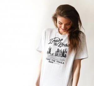
In a custom t-shirt, it's essential that the background colors and the text complement each other; otherwise, you risk creating an unpleasant visual effect. For example, avoid red writing on a pink background and vice versa, or a blue t-shirt with green lettering. Advertising must be clearly visible to be truly effective. Once you've chosen the type of printing ( screen printing or direct printing, while in this case we don't recommend embroidery ) , also choose colors that create a certain contrast between the writing and the shirt. Contrast is, in fact, a very important issue to consider: it refers to the degree of visual difference between the darkest and lightest parts of an image, or the way color tones combine with each other. The strongest contrast will always be black on white or vice versa. However, a black and white t-shirt would be too boring, don't you think? We therefore recommend choosing bright colors on a dark background : high contrast is guaranteed!4) The images and writing are of very poor quality.
Avoid low-resolution images for your promotional T-shirts, as they don't guarantee good print quality. When you send us poor-quality files, we'll usually let you know right away and ask if you can send us a higher-resolution image. If that's not possible, there are some steps we can take to fix the file. In some cases, however, there's not much you can do, and a poor-quality file may only result in a slightly less poor-quality print. Here's a couple of useful tips:- Web images tend to be too small . They are typically 72 dpi and not full-size. Ideally, images should be 200 dpi or higher at full size.
- Another problem with low-resolution images is that they have often been compressed , perhaps more than once, and have visible manipulations caused by the compression.
- If you send a vector file, resolution doesn't matter because these files adapt perfectly to any print size without losing quality. That's why they're preferable. Vector files are typically PDF, EPS, AI, or SVG files.
- Other image quality issues include photos of photos: these suffer from blurriness, poor cropping, graininess, etc. Avoid them like the plague.